
by Eric M. Appleman/Dec. 14, 2008
Designer Sol Sender, who led the team that designed the Obama campaign's distinctive logo, recently posted a couple of videos on the origins of the design.(1) These provide a good opportunity to reflect on the logos used during the course of the campaign.
Logos from the 2008 presidential campaign range from the pedestrian to the distinctive. Most are done in the tradition red, white and blue; often there is a star or stars, and sometimes there are wavy stripes. Various typefaces are used -- serif and sans serif -- and they are done in different styles, for example, bold or regular, all caps or with lower case letters. Some logos highlight or include only the candidate's last name, some include both the first and the last name, and others emphasize or include just the first name (Hillary, Rudy, Fred and Tommy). Most say "for president" or "president" but a few do not. The year is included in about half the logos, and in several cases a slogan or a few key words are included. DesignBay, an Australian firm, has done a study of logos used by presidential campaigns from 1984 to 2008, identified eight key attributes, and correlated them with the success or failure of the candidacies.(2) It is an interesting exercise. Of course, there are myriad and much, much bigger factors involved in the success or failure of any campaign, but the article and the Obama campaign's branding success may prompt future candidates and campaigns to give more thought to the design of a logo.
Observations on some of the Republican campaign logos:
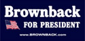
-The Brownback logo goes to extremes; it doesn't include elements of the flag, but a full-fledged flag.
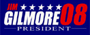
-Although there are a few adjustments, the Gilmore logo is very similar to the logo Wesley Clark used in 2004.
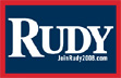
-The simplicity of the Guiliani design complements the campaign's message of strong leadership. No '08 or 2008, no "for president" and no stars, stripes or swooshes are added.
-The McCain logo's use of the Navy Star hints at his military experience. The font, Optima, is the same as that used on the Vietnam Veterans Memorial, although the design firm, Spire Communications in Fredericksburg, VA, says that happened by chance not design.(3) When MCain added Palin to the ticket, his name went on top of the star and line and Palin's went underneath.
-Clearly not much work was put into the Ron Paul design.
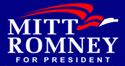
-The Romney logo shows a bit of creativity with the swooshy eagle. The swoosh seems to a bit trendy; for example AFSCME adopted a swooshy logo in 2007.
-The Tancredo logo is a very clean, uncluttered design.
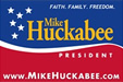
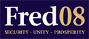
-The buff color in the Fred Thompson logo is unusual. More expected would be a yellow or gold as in the McCain and Huckabee logos.
Notes on some of the Democratic campaign logos:
-Clinton continued the basic logo she used in her Senate campaign. It is solid and fairly conventional and has some resonances with the logo Bill Clinton used in 1992.
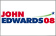
-The Edwards swoosh and star is reminiscent of the Gore 2000 logo; the use of green is a nice addition, conveying freshness and environmental concern.
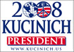
-The Kucinich campaign started with a distinctive logo which tied in with his peace message, but then for reasons unknown dropped it for an out of the box design.
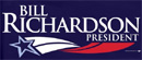
-The Richardson logo has an unremarkable swoosh-stripe and star design.
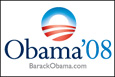
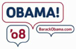
But it is the Obama logo which has been most analyzed and commented upon. As discussed by Sol Sender, his firm was hired in late 2006 through an indirect link with David Axelrod. It had not worked on a campaign before and was given an initial charge to "do something different." Sender, Amanda Gentry and Andy Keene came up with more than a dozen different designs; many of them played around with the "O" in Obama and with the '08.
 |
 |
 |
Finalist logo designs by Sol Sender
and his team.
The blue O with with the
red and white stripes underwent a final important refinement, putting
the stripes at a bit of an angle. This adjustment gives a more
dynamic look, so they are not just stripes, but look like rows in a
field. Sol Sender states the logo means "the sun
rising over the horizon--the dawning of a new day in American
politics." The logo made its first appearance when Obama
announced in Springfield, Ill. on that cold morning in February 2007. Ultimately
it became so ubiquitous that one didn't even need to include Obama's
name.The campaign later made additional refinements, for example, changing Obama to all caps. When Biden joined the ticket, they added his name below. The campaign also produced variations on the logo, for example an LGBT version with colors of the rainbow, a veterans version with stars, and so forth. The logo was an important element of the branding of the Obama campaign.(4)
Notes
1. Sol Sender interview on the Obama logo. VSA Partners, Inc. website, Dec. 9, 2008.
2. [author unknown]. "Study of Symbolism and Tradition in US Presidential Logos. DesignBay. Sept. 24, 2008. [DesignBay, owned by Global Logos Pty Ltd in Sydney, Australia and launched in June 2008, is "a graphic design marketplace with over 80 design studios and freelancers from Australia, the US and India."]
3. Karrie Jacobs. "May the best logo win." Salon.com, Feb. 27, 2008.
4. Another distinctive element in the Obama brand is the Gotham font. designed by the New York firm Hoefler & Frere-Jones. In a 2007 video by Swiss Dots Ltd (a DVD add-on to the 2007 film "Helvetica") Jonathan Hoefler and Tobias Frere-Jones discuss how the font came out of a commission from GQ magazine, which was undergoing a redesign and wanted something "masculine and new and fresh and be versatile" and also "established." Frere-Jones cites the lettering of the entrance to Port Authority Bus Terminal in New York City as being particularly influential.
See also
Ward Sutton. "Reading Tea Leaves and Campaign Logos" New York Times, Nov. 18, 2007.